Manchester School District unveils new logo
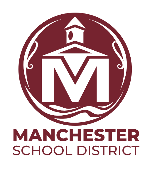
Manchester School District on Thursday revealed its new logo just in time for the new year, a visual refresh that incorporates elements from the city.

MANCHESTER, NH – Manchester School District on Thursday revealed its new logo just in time for the new year, a visual refresh that incorporates elements from the city. The District completed the logo redesign process in-house, first developing a number of potential logos, then narrowing and refining the options through focus groups. Students and staff were asked to vote to choose the final logo – the winning logo was chosen by a 2-1 margin. “We are excited to share this new logo with the community,” said Superintendent Jenn Gillis. “It’s a significant change, but we feel this logo does a great job of capturing our community and history. In focus groups we held, the historical elements in this logo really resonated with people, particularly our students,” Gillis said, adding that the design melds the school district’s present with the city’s past. The logo incorporates visual elements that represent schools and the community: a school clock tower, the Merrimack River, and ornamental flourishes inspired by architecture and signs of Elm Street. The logo’s color is inspired by the red brick exteriors of our schools and mill buildings.“I really want to thank our staff and students who helped us with this process,” Gillis said. “We were impressed by the insights of our students, and the pride they have in our schools and our community.”The new logo will be implemented over the next month including on the District’s new website, which is set to launch in early January.


